|
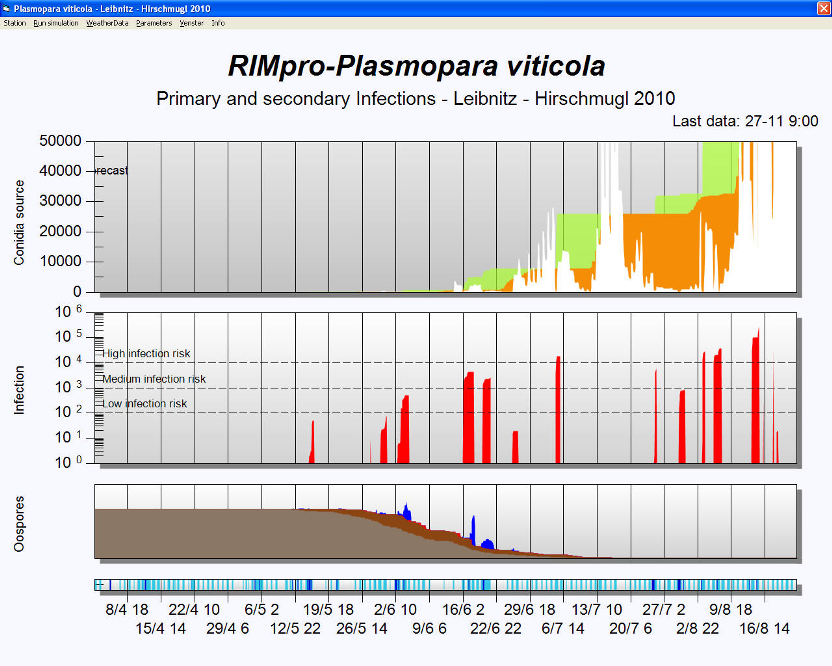
In the baseline of the graph you see a time scale, and
wetness data. Light blue are the hours the crop is wet. Wetness is measured
by leaf wetness sensors, calculated form vapour pressure deficit (VPD), or
forecasted by the meteo service. Dark blue are the periods of measured or
forecasted active rain.
The lowest graph represents the development of the oospore inoculum. Several
stages of maturation of oospores, germination and release of zoospores by
macrosporangia are shown. The resulting quantity of free zoospores during
rain events is shown in blue.
The middle graph represents the infection risk based on the number of spores
splashed on the leaf surface, and the chance they have to infect the plant.
Spores can come from the primary oospore source, or from the secondary
source: conidia produced by lesions.
The upper graph represents the relative development of the epidemic in the
crop as it can be seen in the field as an increase in the incidence of
infected leafs. When an infection has occurred it is show in green during its incubation
period. Once the oilspots become visible it is shown in orange.
When night conditions are favorable for sporulation the quantity of conidiospores
is shown in white. The spore quantity depends on sporulation conditions and
number and age of the sporulating lesions. Gradual mortality of these spores is
calculated from VPD and time.
In the real time calculations the graph has a dashed line on the right hand
side. Left of this line the calculations are based on measured weather data.
Right of this line calculations are extended based on local weather forecast
data.
 |